
UX/ UI Case Study
Conducted UX research, user interviews, and competitive analysis. Created data-driven personas, prioritized MVP features, and designed a WCAG AA-compliant UI with four key screens for an accessible user experience.


Synanopis:
72 Hour sprint, Solo, Contract
72 Hours
Timeline:
IOS
Platform:
Product Designer UX/UI, I conducted UX research, created interview questions, led interviews, analyzed data, performed affinity mapping, developed personas, defined the MVP, designed the UI, and ensured WCAG compliance.
Role:
Figma, Jiro, Google Docs, Excel, Adobe Color, Surveymonkey
Tools:
Problem Statement:
Plasma donation is a critical but often cumbersome process, with users facing difficulties in finding donation centers, booking appointments, and tracking their contributions. The challenge is to design an accessible, user-friendly mobile app that simplifies scheduling, enhances engagement through rewards, and ensures a seamless donation experience for all users.
Problem Overview:
Plasma donation plays a vital role in saving lives, yet many potential donors struggle with inefficient booking systems, unclear reward structures, and lack of engagement. Users need a streamlined, accessible solution that simplifies appointment scheduling, tracks donation history, and provides incentives through a transparent rewards system, ensuring a seamless experience.
Goals:
Simplify Appointment Booking: Create an intuitive interface for users to easily find and book plasma donation appointments.
Track Donation History: Allow users to view their past donations and the impact of their contributions.
Implement a Rewards System: Design a badge and points-based system to encourage regular donations and engagement.
Ensure Accessibility: Follow WCAG AA standards to create an inclusive and user-friendly experience for all ages and abilities.
Enhance User Engagement: Foster a sense of accomplishment and loyalty through personalized notifications and progress tracking.
Design Process:

Research
User Research
User Competition Analysis

Discovery
User Personas
Journey Map
MOSCOW

Ideate
Initial Ideas
Task Flow
Card Sorting
Information Architecture
Yes, and...

Color Scheme
Low Fi Wireframes
Design Tokens
High Fi Wireframes
Final Screed
Design

Recollect
Challenges
What I Learned
What can be Improved
Whats Next
Research:
Based on my findings, I can make the app helpful by simplifying the appointment booking process, providing clear donation tracking, implementing an easy-to-understand rewards system, ensuring privacy, and designing an intuitive, accessible interface for all ages.
Research: Feature Inventory Chart

Insights:
Best Practices
Red Cross and OneBlood set donor-specific UX standards with clear scheduling and reward systems.
Zocdoc excels in appointment booking with effective search filters.
MyChart leads in health data access and patient communication.
Opportunities:
Combine Red Cross and OneBlood's reward systems with
Zocdoc’s search and MyChart’s data tracking.
Prioritize easy navigation and accessible design (large buttons, readable fonts).
Add real-time updates and clear notification prompts.
Research: Persona

About:
Jake Miller (In Need of Money)
Occupation: Part-time Retail Associate & College Student
Location: Bushwick, New York
Age: 24
Background:
Jake is juggling college classes, a part-time job, and student loans. He’s actively looking for flexible, short-term ways to earn extra money without long-term commitment. Plasma donation caught his attention as both a meaningful and profitable option.
Goals:
Easily schedule and track plasma donations
See how much he’s earned over time
Understand the impact of his donations
Stay motivated through rewards and clear progress
Needs & Motivators:
A transparent, easy-to-use app
Clear breakdown of earnings and payment timelines
Gift card or cash incentives
Real-time updates and donation history
A visible connection to how his plasma helps others
Pain Points:
Confusing or hidden payment details
Long wait times or unclear scheduling
Apps that don’t show donation impact or progress
Research: Journey Map

Opportunities
Gamify with streaks, bonus goals, impact stories, and tiered rewards
Use relatable, clear messaging about safety, impact, and quick rewards
Simplify onboarding; highlight real donor stories and payment timelines
Filter by distance, time, reward, and show recommended locations
Show “what happens next,” track donation journey, notify when plasma is used
Transparent reward tracking with push notifications and milestone badges
AH HA Moments
“Nice! Got my payment and earned a badge. Worth coming back.”
“I hit a donation streak and unlocked a higher reward tier!”
“I can help people and get paid? That’s actually worth looking into.”
“Wow, I can choose the day and see rewards up front.”
“Found a place 10 minutes away that gives gift cards!”
“They even showed me what my plasma is used for. That feels good.”
Design: MoSCoW
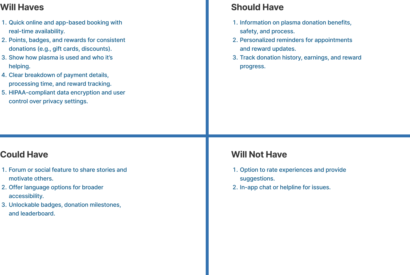
Using MoSCoW for project focus.
Goal: Find an MVP (Minimal Lovable Product) for A week sprint.
Design: Mobil App Information Architecture

User-Driven Features & UX Highlights
Personalized Appointment Matching
Users can filter donation sites by date, distance, reward, and blood journey, helping them find the best option that fits their schedule and values.Dual View Navigation (List & Map)
Users can switch between map view for visual location scanning and list view for quick appointment comparisons, enhancing control and flexibility.Reward-Driven Motivation Loop
Built-in gamification with points, badges, and tangible rewards keeps users engaged and encourages repeat donations.Redundant Access Points for Efficiency
Critical actions like managing appointments are accessible from both the Profile and Journey, reducing user friction and supporting different workflows.
Contextual Map Interactions
Users can zoom and view real-time reward offers on the map, creating a sense of exploration and discovery.Emphasis on Self-Tracking
With donation history, health notes, and receipts, users gain transparency and a sense of ownership over their donation contributions.Expandable Results for Detail-First Design
Tapping into “matches” reveals expanded data like location + date + time + reward, providing depth only when needed—reducing cognitive overload.Encouragement Through Storytelling
The “Blood Journey” feature creates a narrative around donations, transforming a medical task into a mission with purpose.
Design Phase: Style Guide
Emphasized WCAG-accessible colors.
Agreed to keep current typography/logos, limited to 4 sizes.
Demonstrated commitment to inclusivity.
Aligned with accessibility guidelines.
Color Palet:

Typography:
I chose the Poppins typeface for PlasmaHero because it's clean, easy to read, and works well across mobile screens. To maintain visual consistency and meet WCAG standards, I limited the font sizes as follows:
Heading: 24pt bold
Subheading: 24pt regular
Body text: 16pt regular


Version 1:
Version 2:

Design Phase: User-Centric Design Thinking
Design Thinking
Designed a mobile-first, WCAG AA-compliant appointment interface focused on inclusive usability. Employed gesture-friendly sliders to reduce input friction, applied clear visual hierarchy for rapid information parsing, and prioritized touch accessibility. Leveraged UI patterns from Zocdoc to streamline user flow, support cognitive ease, and offer toggleable list/map views for spatial flexibility.

Design Phase: High-Fidelity Mockup
Login Page

Profile Pages

Appointment Page

Royalty Page

Recollect: PlasmaHero
Conclusion:
PlasmaHero empowers users like Jake with a fast, transparent, and purpose-driven donation experience. By combining intuitive navigation, real-time reward tracking, and emotional storytelling, the app transforms plasma donation into a meaningful habit.
Reflecting:
This was a fast-paced design sprint focused on validating core user needs. While the initial solution addressed key pain points—like scheduling friction and lack of transparency—there’s still room to refine and validate with broader user input.
Looking ahead:
Given the time constraints, I plan to conduct more A/B testing on UI elements, reward structures, and user engagement flows. Deeper usability testing will ensure Plasma Hero remains both scalable and emotionally resonant as it evolves.